A company without a website is a shop without a sign or Superman in disguise, unnoticed. You’ll need a website to show the world who you are and convert more clients. If you look around, people are using more than just computers to look at websites. You can look at websites on your laptop, phone, tablet, fridge, TV, or smartwatch.
With screens everywhere, you want to ensure that your website looks good viewed from any device. That’s where responsive web design comes in.
You can take our website as an example…
Table of Contents
The Issue
Making your website work on smartphones was paramount. More and more people use that as their sole tool for web searching. However, web designers and website owners encountered a big problem: screen size.
They had to create a different website for different screen dimensions and orientations. As technology became more diverse, screens also increased in size. There are so many screens, but you can choose to use them in portrait or landscape mode. The website must look good on both.
Making a new design for every size and orientation became overwhelming and unsustainable. So what should one do? Do you give up the users of some devices in favour of others? No, you don’t.
Facing this problem required web designers to think outside the box. They figured out a whole new approach to designing websites. While they were less reliable in the beginning, solutions soon appeared.
Now there are technologies and tricks that we use to beat this problem.
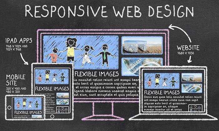
Flexible web design, which adjusts for screen size and orientation, is called responsive web design.
Why do we call it responsive web design?
Adding the word responsive means that it reacts to things in some way. We borrowed the term from architecture, and with constant innovation and the advancement of technology, a new approach to architecture emerged.
Architects started chasing the goal of a building that was comfortable for many different sizes of groups of people. Suppose we talk about an art museum. While there’s a big exhibit, it could be packed with people, and there could be very few people on a slow day.
The responsive architect approach would look at how to use pressure sensors to calculate the density of people and change the lighting, adjust the seating, and alter the temperature. Trying to ensure that they are comfortable no matter the size of the group in a room.
Web designers realized architects don’t build a building for different group sizes. Similarly, they don’t need to build a whole website for every device on the market and how those screens can be oriented.
This is possible by using flexible design elements and automating the website’s adjustment to screen size.

The Solution
So how does this work? What magic do web designers do to make the same website look just as stunning on a phone as it does on a large computer screen? Knowing what’s behind the curtain will help you when you have your website built. Here are some of the tools of the trade.
However, it’s useless if you can’t appreciate it.
Web designers can use the width or max-width property to make imaged changes in size according to the dimensions of the page opening. They can also optimise images to make websites run faster. It’s wise to use a high-resolution image on a big screen and a low resolution on a small screen. Since phones are more lightweight technology, they need lightweight website features for the loading time.
Another solution is to zoom in on images in an aesthetic way. Instead of keeping the whole picture, you zoom in on the image for a smaller screen. You can even make it so the user can move it around to see the whole thing. With the right photos, this becomes a fun design feature.
Responsive Text
Web designers have found ways to automate text resizing to differently sized web pages. The text on the website is the medium of communication between the brand and the potential customer. You can do this using basic HTML, meaning it’s not development-heavy.
Custom Layouts
If the screen size changes to such an extent, it might look better if the page layout changes entirely. For that, web designers do not have to make several layouts using design software. Instead, they utilise what’s called a style sheet. That is code that defines different elements of the page and their dimensions. To make multiple style sheets, you need only write a few lines of code.
The appropriate style sheet will change the layout when a specific layout doesn’t fit on the web page. For example, if some text is in columns on a landscape web page, it can be in rows on a portrait one.
Why Should You Care About Responsive Web Design?
Getting a website made feels daunting to many people. Not everyone is tech-savvy. It’s natural to fear you’d be out of depth while talking to the web design team about your website. Knowing what responsive web design is will help you feel empowered. If one of your priorities is that everyone should see a stunning version of your website, no matter what size of their screen, then go ahead and mention responsive web design while hiring a web design firm.
Conclusion
A memorable website makes for a good customer experience. You must think about a lot of things while getting your website built. Web design focuses on making your website look stunning, leaving an impression on the customer, communicating your brand image, and converting customers. Responsive web design ensures that it’s successful no matter the size of the screen used.
To make sure your responsive web design needs are met, contact Us or visit our website today.
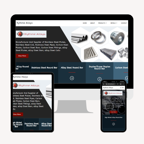
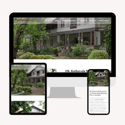
A Glimpse of our work
Related Posts

Why Are Product Reviews Important For WordPress eCommerce?
Introduction: Having an online presence has become a must for businesses. WordPress is one of the most trusted and easy platforms to help businesses create

The State of WordPress (2024) | WordPress in 2024
What do you think about the State of WordPress this year? Browsing via SEO news pages or blogs, you may see posts or concerns about “WordPress is

Why WordPress is the Perfect Choice for Your Business Website
In today’s digital age, having a strong online presence is essential for businesses of all sizes. A well-designed and functional website can be a game-changer


